
The lighting and composition are the main features of this magazine cover. I love how the eye is drawn immediately to the character’s faces, and the composition is so minimalistic. Due to the dark theme to the movie, the poster has stayed faithful to this and kept a dark, shadowy feel. There is minimal text but is still clear for the audience to read. I think this poster focuses more on promoting the image and the characters rather than trying to create a focus point on the text.

The alignment of the text on this movie poster is the most important feature here. I love the consistent text making its way down the poster of different phrases to symbolise the feelings that this movie consists. Similarly to the Twilight movie poster, the lighting really finishes the image nicely. The lighting appears to be coming from a strong sun that symbolises love and happiness. Whereas the Twilight poster was all about keeping it dark and mysterious. This movie poster has quite a busy composition, even the image has background focus points which shows where some of the scenes will take place in the movie.
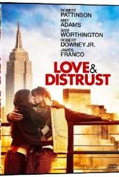
Again, the lighting takes a major part in this movie poster. Similarly to Like Crazy, the sun appears to be coming from a strong sun and they have a setting placed in the background of the image. However the text on this poster is a condensed down a bit. The title stands out in red, taking the colour from the characters’ clothing. The text is placed in the blank space on the poster to fill the frame.

This movie poster is possibly one of the most famous posters in the world. I love the photo editing done on Photoshop where they have blended two images - one of the Titanic ship and one of the two characters. The composition is perfect - the ship’s end points and leads the eye to the characters’ faces whilst the writing is situated in the blank spaces of the ship.

The image is what does it for this movie poster. The text is rather simple in a standard black, clear font which symbolises the idea of a ‘notebook’. The image itself is stunning, showing the audience immediately that the story is about a romance. The rain in the image shows one of the scenes within the movie too. I love how the lighting behind the characters is shining through between their faces.

The colour palette here is yellowy and white which are quite pure colours. The characters are situated on a beach, suggesting the setting and location in the movie. The film logo of “Dear John” is big and bold, standing out from the rest of the small text. The top of the poster is kept simple with only the actor’s names and the rest of the text at the bottom of the poster. I think this divides the composition perfectly.

The grids on this movie poster is the main feature. They have create boxes of different sizes with different images in each one to show different feelings and themes within the movie. The biggest image is of a couple which suggests romance is the main theme within this movie. The text, similarly to Dear John, is yellow with the main words in the title being bold. The rest of the text is white and a lot smaller.
No comments:
Post a Comment